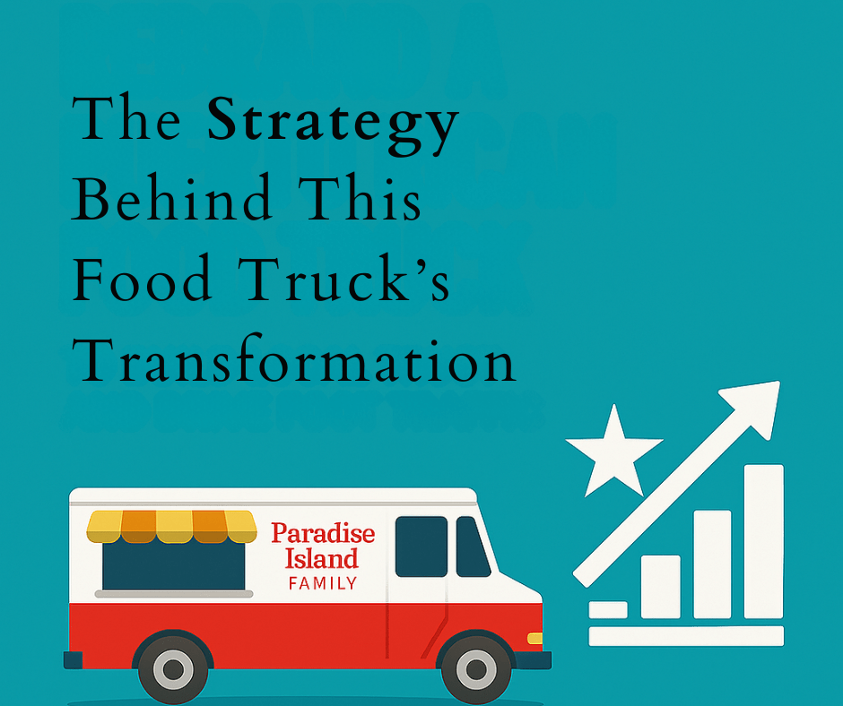
Intro:
The food truck industry is loud—visually, vocally, and competitively. But most trucks still rely on flavor alone to speak for them. In this landscape, Paradise Island 6 had something more to offer: a generational story rooted in the story of Lajas, Puerto Rico.
The mission was clear—transform a beloved but overlooked food truck into a local brand that take visitors on a journey to Lajas.
This goal was to turn a family’s legacy into a powerful driver of visibility, connection, and growth.
Challenge:
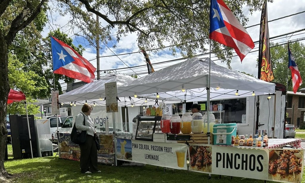
Paradise Island 6 had all the heart—just not the infrastructure to match. Despite their loyal customer base, they were running into real issues that limited their growth:

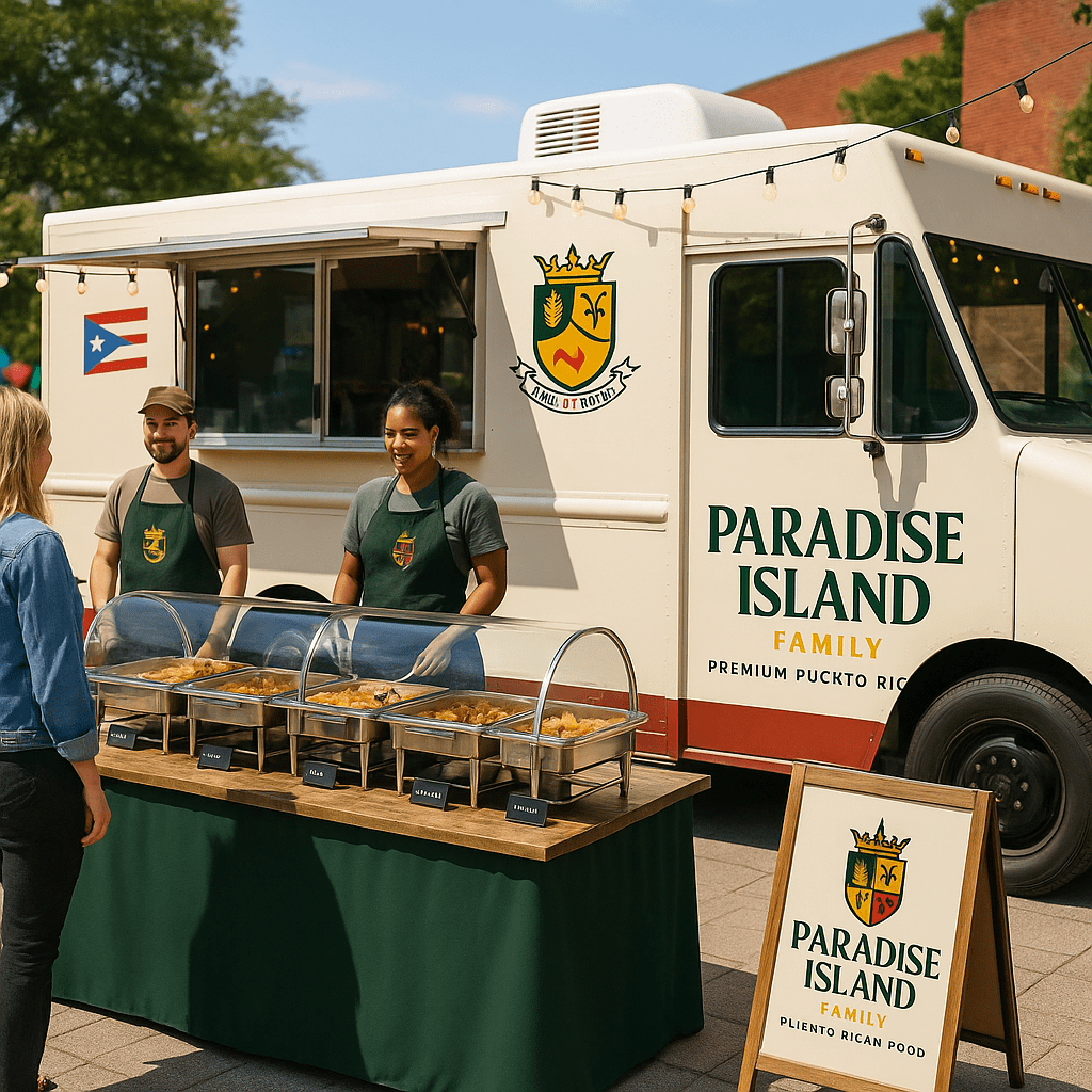
- No cohesive brand identity: The logo was pixelated and mismatched across touchpoints, from banners to payment platforms.
- Weak digital footprint: They had no official website, no Google Business profile, and no streamlined way to be found or followed.
- Inconsistent visual assets: Menu posters and signage lacked alignment; causing confusion rather than recognition.
- No system for customer reviews or engagement: Word-of-mouth was their strongest asset, but there was no formal way to capture or amplify it.
They weren’t just underrepresented online—they were invisible in all the places that mattered.
My Approach:
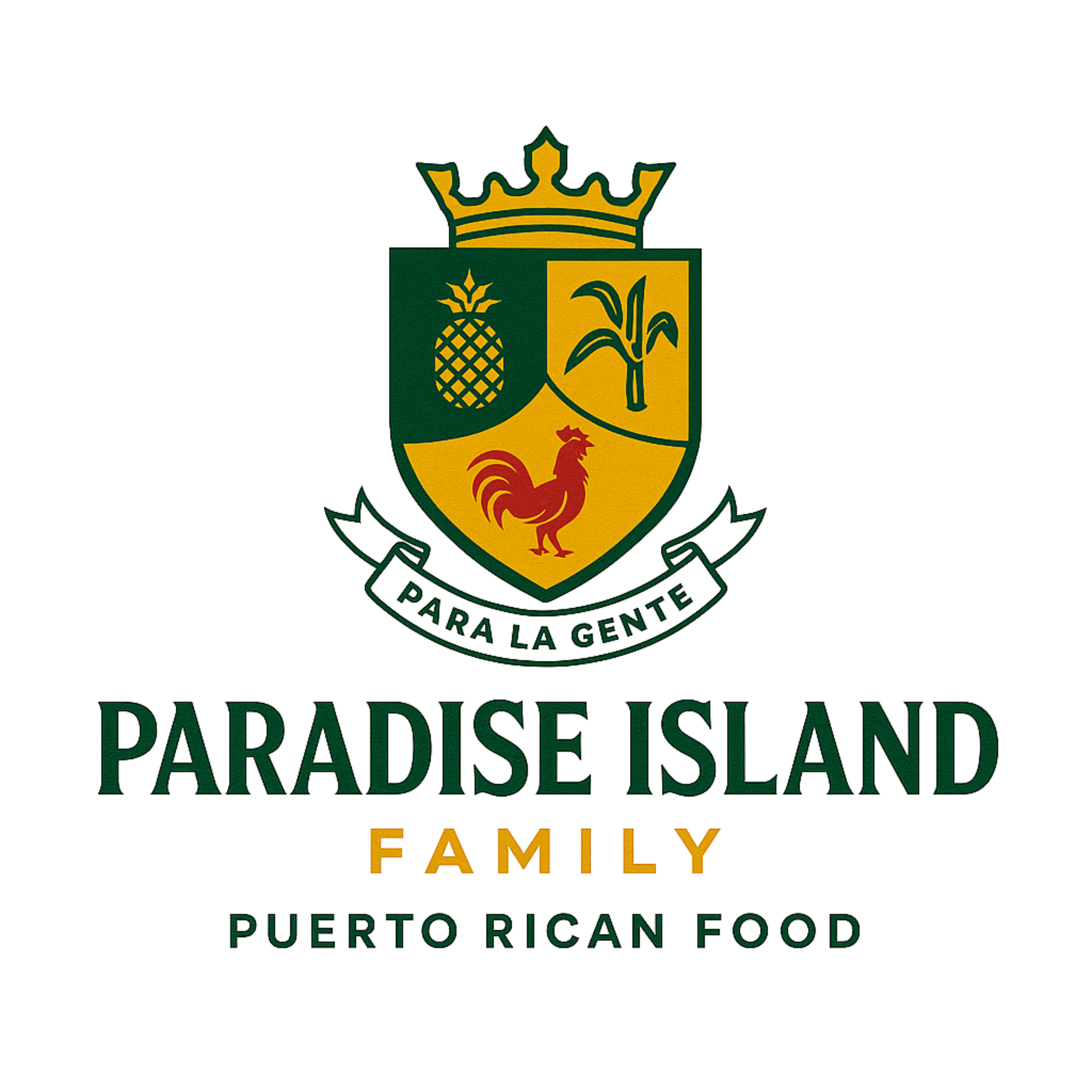
Rebranding from “Paradise Island 6” to “Paradise Island Family”
I helped guide the shift from a location-based name to one that evokes community and generational pride. “Family” gave the brand more warmth, approachability, and a built-in emotional connection with audiences.
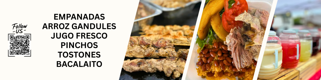
Designing a Brand Story Banner
Instead of a generic tagline, I wrote a condensed brand story rooted in their background. This banner was designed for events, proudly introducing where the family comes from, what La Parguera is known for, and inviting curiosity beyond San Juan.
Creating a One-Page Website Prototype
Using limited tools and time, I built a simple site that showcases the menu, story, and contact info—with clear visual hierarchy and mobile-friendly design. The goal: drive traffic to facebook.
Rebuilding Their Visual Assets from Scratch
From high-res vinyl banners to QR code designs, I recreated every print piece in the new brand style. I made sure everything—colors, typography, photos—felt unified, so the truck finally looked like the business it actually was.
Results:
By the end of the first month, Paradise Island Family had:
- A full brand identity shift with consistent visuals
- A marketing strategy rooted in their culture
Even without metrics, the shift was clear: they felt proud to hand people a flyer, show off their menu, or direct them to a link.
Next Steps:
In the next phase, I’ll:
- Update printed design and marketing material
- Launch and optimize their Google Business profile
- Set up a official website
- Catering outreach and advertising plan
Final Thought:
This project reminded me why I love working with small businesses. It’s not about marketing; it’s about helping people feel seen.
Now Paradise Island Family can proudly introduce the flavors of the island to the streets of Connecticut.

Leave a comment